ADAPTIVE WEB DESIGN
Optimised for its viewing environment, not jumbled up to fit the viewing screen!
22 January 2021
The early version of responsive website design was called Adaptive Web Design (AWD). There’s very little talk of it now that a newer version called Responsive Web Design (RWD) has become mainstream. They both do the same thing by allowing you to view your website on any sized screen but they differ in the mechanics of how this is done.
With RWD everything is served up from the server to your device whether that’s mobile, tablet or desktop. Your browser, through using the created predefined CSS breakpoints set by the designer/developer, will rearrange your site to fit the screen dimensions it finds itself on, but with that it has served up every element and every bit of code your website consists of as well. This leads to one of the biggest problems on mobile: page load speed. Imagine an A3 sized image (needed for retina display desktops) loading on your mobile and then, the CSS reducing the dimensions (but not the file storage size) down to a manageable screen size so it works on your mobile website layout… are you getting the picture? It’s a bit like trying to fit a wardrobe full of clothes into a suitcase - something has to give! And what if there were, let’s say, 7 of those sized images… well you can imagine how slow this would take to load on your device. You as the user comes to the point of clicking the back button because, let’s face it, who has the time or the patience to wait… so you say ….next!
AWD virtually does the opposite for the end-user. Admittedly, a little bit more work needs to be completed before you launch your website but with the Sitely app that’s just about a no-brainer! With AWD the server detects the device you are using and will only serve you up what has been optimised for your screen size. The result is a very fast page loading website and a much better experience for the end user.

“
With Adaptive Web Design (AWD) the server detects the device you are using and will only serve you up what has been optimised for your screen size. The end result is a very fast page loading website!…
Another advantage of AWD is that the content isn’t moved around to fit the screen so everything remains in chronological-marketing order to make the impact you’d intended in the first place!
A third advantage of AWD is that you can serve up an optimised site orientated to mobile users that are on the go. Desktop users, on the other hand, can pay more undivided attention to what they have in front of them. The same content but made adaptive by the web designer (not web developer or program) to the viewing environment it finds itself in.
So, as the name suggests, AWD is very much adaptive to the situation it finds itself in, based on the online presence or marketing campaign behind it. It doesn’t frustrate the end-user with the loading speed, mis-arranged or rearranged layout or font hierarchy. With RWD a lot of the mobile breakpoints are left up to the website builder platform to auto-compile which saves time to build out the website, sure, but results in compromising and frustrating the user’s experience! Did you know that the end-user gives 3-7 seconds of their time when they first view your website on their mobile device? If it doesn’t start loading or doesn’t load properly in that time, you’ve lost them, they’ve clicked that back button and moved on. You don’t want an automated platform process to screw up this important few seconds for you!
As mentioned several times throughout this website, the Sitely app allows you superb control over the online presence / business that you intend to serve up to the end-user. With it connected to Google Analytics it provides data and feedback on how your end-user is interacting with your website, allowing you to make tweaks and further improve their experience, if necessary.
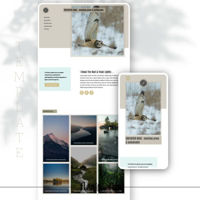
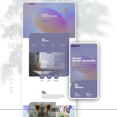
Flamin’ Fig’s theme kits are based on Sitely’s adaptive web design approach allowing you control over anything you’d like to serve up. You’ll get a fast page load and clean W3C web standard html/CSS/javascript code making up your website once you hit the publish button. The other great bonus of AWD is the accuracy of the layout and elements. What you see on your local macOS machine’s preview is what you’ll see live in the browser across macOS and Windows10, iOS and Android plus a plethora of modern W3C browsers on desktop, tablet or mobile devices.
POST THOUGHTS
To have you better understand Adaptive Web Design: if you were to look at magazine print (over newspaper print) this will serve as a great analogy and explanation…
A Print Designer has been given a brief and the task to create a 1 page magazine article that will run in a magazine, but also a billboard and a no-fold brochure. Firstly these three different print mediums will be interacted with in very different ways! So it is very much up to the Print Designer to understand the environment these three different print mediums will find themselves in and how they will be interacted with by the end-user. The Print Designer is tasked with making the best connection to the end-user based on their given brief and the three different sized mediums needing to be used (simulating large desktop, tablet, and mobile screen sizes).
Because the bigger of the three mediums will have the end-user see it from a distance, the images and text will be far larger filling out the huge area that the Print Designer has to work with. Being on a billboard, the key points need to stand out to grab the attention and make that vital emotional connection. The magazine is more personal and laid back, being in the end-user’s hands and so the text and images are of a more appropriate size and configuration for reading. It will be the layout and the elements used that will either grab the end-user’s attention or have them flick over to the next page. The brochure becomes tricky as it’s a much smaller area that has to command attention; it has to stand out and emotionally grab the onlooker for it to be picked up and read. Again the layout and arrangement of the elements will be very important so as to garner their attention, pick it up, and then to have them turn it over to read the rest of the content.
If we take what is happening in the automative web design world and apply it to the print world then this Print Designer would have only had to create this print design for the billboard, then clicked a button and have the rest of the work done by the software’s interpretation! Without question the Print Designer has saved a lot of time only designing for one medium but the magazine page and the no-fold brochure are a failure because they aren’t meant to be miniature billboards and this isn’t the expected experience the end-user was looking for!
Lastly, the beauty of AWD is that it’s made for web/graphic designers to have total control over the layout that’s presented to the end user’s device, and doesn’t rely on a guesstimation by the code or browser.


Back to Blog Posts