JUST TWO EDITABLE DEVICES
A much more efficient way in creating a responsive Sitely websites.
18 December 2022
At Flamin’ Fig we are always testing, innovating, and checking data for insight into the patterns of the everyday website User across, not only Australia, but also around the world. In doing this it gives us a better and more future proof way of presenting our website themed templates that are created for the innovative Sitely App.
Our learning and understanding has gotten us to take a different approach in how we present our Flamin’ Fig website themed templates when it comes to “devices”, the heart of website responsiveness in the Sitely App.
Sitely’s “devices” (responsive breakpoints) are the responsive fixed-width versions of your website and the builds look like this: Build out your website on the960 device and once done you convert it to the 1200 device (large desktop) and the 768 device (portrait tablet). You also introduce your 320 device (portrait mobile) but because of the much smaller width you need to rearrange the layout, resize your images, and increase the text sizes. Sounds simple enough, but there is a bit of work involved to create the final product!
Now back to our research and testing…
Information abounds but of particular use and interest are website statistics which provide invaluable information on how website Users interact with websites around the globe and on what device.
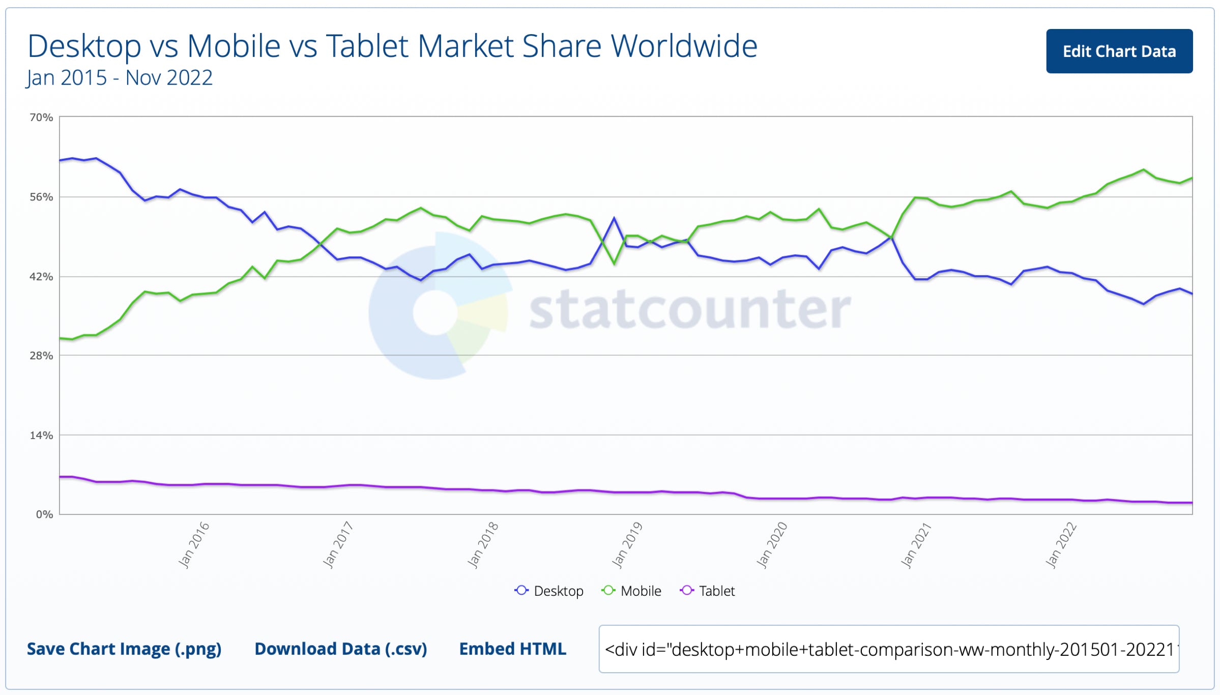
Data from these statistics shows that mobile phones are used more than any other device, followed by desktop, and lastly the tablet.
Why is that?
Tablets are really convenient and do a fantastic job in producing and creating, as well as digesting information and media. They have their place between the small device world (mobile) and the big desktop world but, according to web statistics, something changed in late 2019 causing the further decline in tablet usage.
In that same time the mobile device usage (except for a minor dip) further increased and is currently at 58.27% worldwide ahead of the desktop which is 39.72% worldwide as of November 2022.
The main reason that the tablet Viewer has declined so much (down to 2.2% worldwide) is that from late 2019 onwards the mobile phone increased in size and functionality to almost equal that of a tablet.
So in seeing these real-life website usage statistics dated from Jan 2015 to today (1 November 2022) it is very obvious that mobile is the preferred device followed by desktop / laptop, and lastly tablet which is barely holding its single digit position.
Knowing all this has made us change the way we look at and use Sitely’s “devices”, aka responsive breakpoints.


“
The biggest reason that the tablet Viewer has declined so much (down to 2.2% worldwide) is that a mobile device is just about a tablet device in size nowadays, which started back in late 2019
The way we go about building out our Flamin’ Fig templates overall reduces the amount of work in creating the final result, and streamlines our workflow so that less can go wrong.
We start our projects by building out our templates in the 960 device. While building out our template we take into consideration our font style’s text sizing because the text size we choose will have a large effect on the desktop and tablet device. The reason being is that once we are finished with our 960 device we auto-scale the 1200 device, and we also auto-scale the 768 device. Sitely does all the work here as it scales up our 960 device to work on the 1200, and it scales-down our 960 device to look the part on the tablet device. In other words, in one step we have taken care of the tablet, the laptop, and the desktop.
The only thing left to do now is the 320 device. There is no getting around this one as we go about manually adjusting the layout, increasing the image sizes, and increasing the text sizing to all look balanced, spaced and legible.
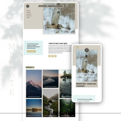
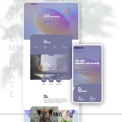
So in short, Flamin’ Fig templates are built meticulously to 2 adaptive responsive breakpoints (devices) instead of all 6 we find in Sitely. That means there are only 2 devices to look after whilst the larger desktop and the tablet are taken care of by Sitely’s auto-scale feature.
For us it is a big reduction in work and has streamlined our workflow tremendously! This also totally supports the real-life statistical data for the last 7 years wherein mobile and desktop are the main devices Users use to interact with websites all across the world.
This far more simplified workflow using only 2 Devices has been a game changer for our clients as now they just need to focus on their desktop and mobile, the rest is taken care of by Sitely.
Also, by editing the text of your content on desktop you are automatically doing so on mobile. When changing out images on your desktop you are again automatically doing it on mobile and likewise with changing the font styles or colours - so easy!


